Jira Dashboards in 2026: The Complete Guide (Plus What's Coming Next)

Introduction: Dashboards Are NOT Dead
Let me address something I hear from clients constantly:
"Mike, are dashboards still relevant? Should we even bother?"
My answer: Absolutely yes. And here's why this question keeps coming up—and why the answer matters more than ever.
This video is from 2024 but the formula is still 100% up to date
After 14 years consulting for organizations like BBC, Vodafone, NHS, and Lloyds Bank, I've watched Jira evolve dramatically. The interface has changed, new features have emerged, and yes—there's been a shift in how teams consume information. But dashboards remain one of the most underutilized and powerful features in Jira.
Think of a dashboard like the cockpit of an airplane. If you're a Scrum Master, Product Manager, Team Lead, or executive, you don't want to jump from project to project to understand what's happening. You need a single view that shows you the big picture.
That's what dashboards deliver—and they're about to get significantly better.
In this comprehensive guide, I'll cover:
- Why dashboards are still essential (despite the shift to summaries)
- The new Home Dashboards beta that's changing the game
- How to build effective dashboards using filters and JQL
- The consultant's approach to dashboard strategy
- Common mistakes and how to avoid them
- When to use dashboards vs. project summaries
Let's dive in.
The Current State of Jira Dashboards (2026)
What's Changed?
If you've been using Jira for years, you've noticed some shifts:
1. Project Summaries Have Improved
Each Jira project now offers sophisticated Summary views—especially team-managed projects. These summaries include:
- Sprint progress
- Issue distribution
- Recent activity
- Key metrics at a glance
What I'm seeing with clients: Some teams have almost stopped looking at traditional dashboards because the project summary gives them enough information. For simple, single-project teams, this might be fine.
2. "Your Work" Replaced the Default Dashboard
Jira Cloud now opens to "Your Work" instead of a dashboard. This is a personal task view, not a team-level reporting tool. Many users don't even know dashboards exist anymore.
3. Built-in Reports Still... Aren't Great
Let's be honest: Jira's built-in reports haven't improved much. They're still limited, inflexible, and require manual navigation. If you want consistent, saved reporting views, dashboards remain your best option.
Why Dashboards Still Matter
Despite these changes, dashboards remain essential for:
✅ Cross-project visibility — Summaries are project-specific. Dashboards aggregate across multiple projects.
✅ Stakeholder reporting — Executives and PMs need consolidated views, not project-by-project navigation.
✅ Persistent saved views — Unlike reports, dashboard configurations persist. Your filters and gadgets stay configured.
✅ Shareable team cockpits — Everyone on the team sees the same data, updated automatically.
✅ JQL-powered precision — Dashboards can show exactly what you need based on custom queries.
My Consultant Take:
When clients tell me they've stopped using dashboards because "summaries are good enough," I ask:
"How many projects does your team work across?"
If the answer is one project—maybe summaries are sufficient.
If the answer is two or more projects—you need dashboards. Full stop.
🚀 The Game Changer: Home Dashboards Beta
Here's the exciting news: Atlassian is completely reimagining dashboards.
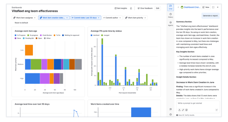
The new Home Dashboards (currently in beta) represent a significant upgrade over traditional Jira dashboards. This isn't a minor UI refresh—it's a fundamental improvement to how dashboards work.

What's New in Home Dashboards Beta
Based on Atlassian's July 2025 release notes, here's what's coming:
1. Dashboard Insights (AI-Powered)
Get AI-generated summaries of your dashboard data. Instead of just showing charts, the dashboard explains what's happening:
- Brief summary of key findings
- Notable highlights requiring attention
- Ability to ask questions about your data
Why this matters: You don't just see that 15 issues are blocked—you understand why this matters and what to do about it.
2. Smart Link Widgets
Embed external content directly into dashboards:
- Confluence pages
- Goal updates
- Loom videos
- Content from 30+ third-party apps
Example use case: Embed a Loom video explaining the dashboard's purpose, so stakeholders understand the context without a meeting.
3. Live Drilldowns
Click on any chart element and immediately see the underlying issues. Update work items without leaving the dashboard.
Why this matters: Traditional dashboards show data. Home Dashboards become actionable launchpads for daily work.
4. Jira Service Management Integration
New data points specifically for JSM reporting:
Using JSM? Check out my JSM SLA Configuration Guide for tracking service metrics.
- Channel
- Organization
- Portal group
- Request type
- Satisfaction rating
- SLA breached
- SLA cycle type
- SLA name
- SLA paused
- SLA start/stop dates
- Work category
Why this matters: Finally, unified reporting across Jira, JSM, Goals, and DevOps in one place.
Coming Soon
Atlassian has announced additional features in development:
Single Value Charts — Highlight key metrics (KPIs) prominently Chart-Level Filtering — Apply up to 5 filters per chart for comparative reporting
How to Access the Beta
Home Dashboards are available for Standard, Premium, and Enterprise customers (Free editions coming soon).
To enable:
- Go to Atlassian Administration
- Select your organization
- Navigate to Settings > Platform experiences
- Toggle on "Beta features"
- Review and accept terms
My Recommendation: If you're on a paid plan, enable the beta now. Start experimenting. This is the future of Jira dashboards, and early adoption gives you time to adapt.
The Foundation: Filters First, Dashboards Second
Here's where most people go wrong: They start building dashboards without creating filters first.
This is backwards. Let me explain the correct approach.
Why Filters Are the Foundation
A filter is a saved JQL query. When you build dashboard gadgets, most of them ask: "What data should I show?"
The answer is almost always: a saved filter.
Without filters:
- You recreate queries manually for each gadget
- Changes require editing multiple gadgets
- No reusability
- Inconsistent data across gadgets
With filters:
- Build once, use everywhere
- Update the filter, all gadgets update automatically
- Consistent data across dashboards
- Shareable with team members
Essential JQL Patterns for Dashboard Filters
You don't need to be a JQL expert, but knowing these patterns helps:
1. My Open Work
assignee = currentUser() AND resolution = Unresolved ORDER BY priority DESC
Shows: All unresolved issues assigned to the logged-in user
2. Team's Work This Sprint
project = "PROJECT-KEY" AND sprint in openSprints() ORDER BY status
Shows: All issues in the current active sprint
3. Recently Created Issues
project = "PROJECT-KEY" AND created >= -7d ORDER BY created DESC
Shows: Issues created in the last 7 days
4. Blocked or Flagged Items
project = "PROJECT-KEY" AND (status = Blocked OR flagged = true)
Shows: Items that need attention
5. Overdue Issues
project = "PROJECT-KEY" AND duedate < now() AND resolution = Unresolved
Shows: Unresolved issues past their due date
6. Cross-Project Query (Multiple Projects)
project IN ("PROJECT-A", "PROJECT-B", "PROJECT-C") AND status != Done ORDER BY updated DESC
Shows: Open work across multiple projects
7. Issues Without Estimates
project = "PROJECT-KEY" AND "Story Points" IS EMPTY AND issuetype = Story
Shows: Stories missing estimation
How to Create and Save Filters
Step 1: Navigate to Filters in Jira
Step 2: Use Basic or Advanced search to build your query
Step 3: Click Save filter and give it a meaningful name
Naming Convention (Critical!):
❌ Bad: "My filter" / "Test" / "Issues"
✅ Good: "[PROJECT] Open Bugs" / "[TEAM] Sprint Blockers" / "[PM] Overdue Tasks"
Include the project or team name so filters are identifiable when shared.
Step 4: Set permissions (who can see/use this filter)
Step 5: Star important filters for quick access
Building Your First Dashboard
Step 1: Create the Dashboard
Navigate to Dashboards → Create dashboard
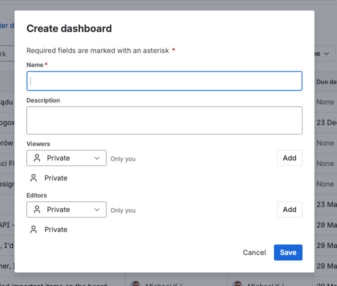
Configuration:
- Name: Use a clear, descriptive name (e.g., "Engineering Team Overview" or "Q1 Sprint Dashboard")
- Description: Optional but helpful for shared dashboards
- Sharing: Configure viewers and editors
Step 2: Set Sharing Permissions
This is critical and often overlooked.
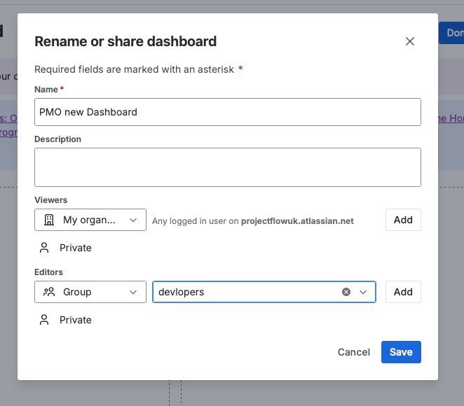
Sharing Options:
- Private: Only you can see it
- Project: Anyone with access to specified project(s)
- Group: Members of specific groups
- Public: Anyone in the organization
My Recommendation: Use Project-based sharing for team dashboards. This automatically includes everyone who has access to the relevant project(s).
Important: Don't forget to click Add after selecting permissions. Many people configure sharing but forget to add it to the list.
Step 3: Choose Your Layout
Jira offers different column layouts:
- Single column
- Two columns
- Three columns
My Preference: Two columns for most dashboards. Three columns if you have a large monitor and need more gadgets visible.
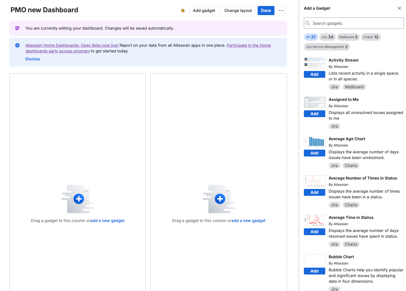
Step 4: Add Gadgets
Click Add gadget to open the gadget gallery.
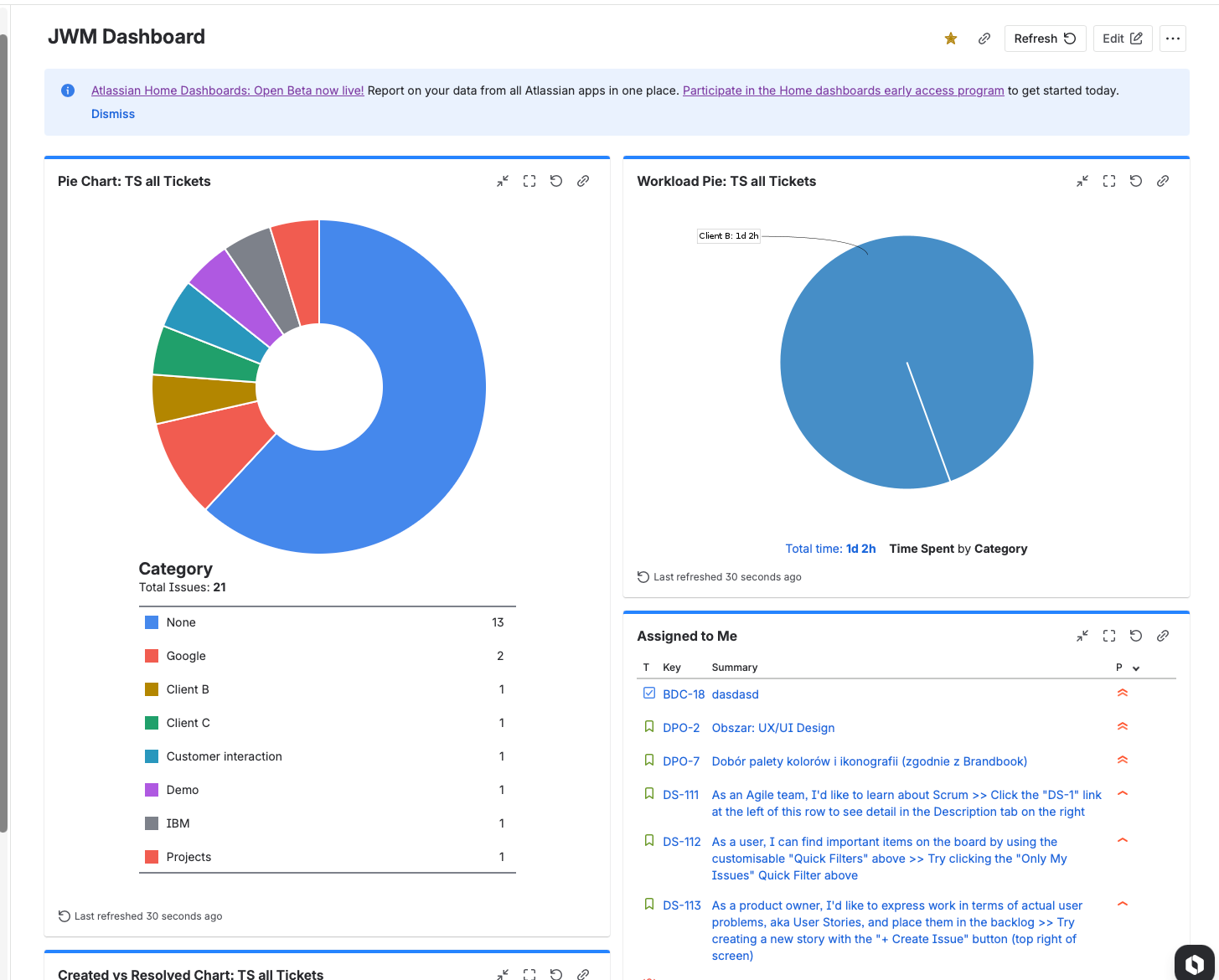
Essential Gadgets (The Consultant's Must-Haves)
After configuring hundreds of dashboards, here are the gadgets I recommend:
Tier 1: Must-Have Gadgets
1. Starred Filters
Why it's essential: This gadget shows all your starred (favorite) filters as clickable links. It's your personal navigation hub.
How I use it: I create 5-10 specific filters for my work and star them. This gadget gives me one-click access to all of them.
Pro Tip: This is often more useful than adding multiple filter result gadgets. One Starred Filters gadget can replace 5+ individual gadgets.
2. Filter Results
Why it's essential: Displays issues from any saved filter as a list. The workhorse of dashboard reporting.
Configuration:
- Select your saved filter
- Choose columns to display
- Set auto-refresh interval (15 minutes is typical)
When to use: When you need to see a list of specific issues (e.g., "My Open Tasks," "Team Blockers," "Overdue Items")
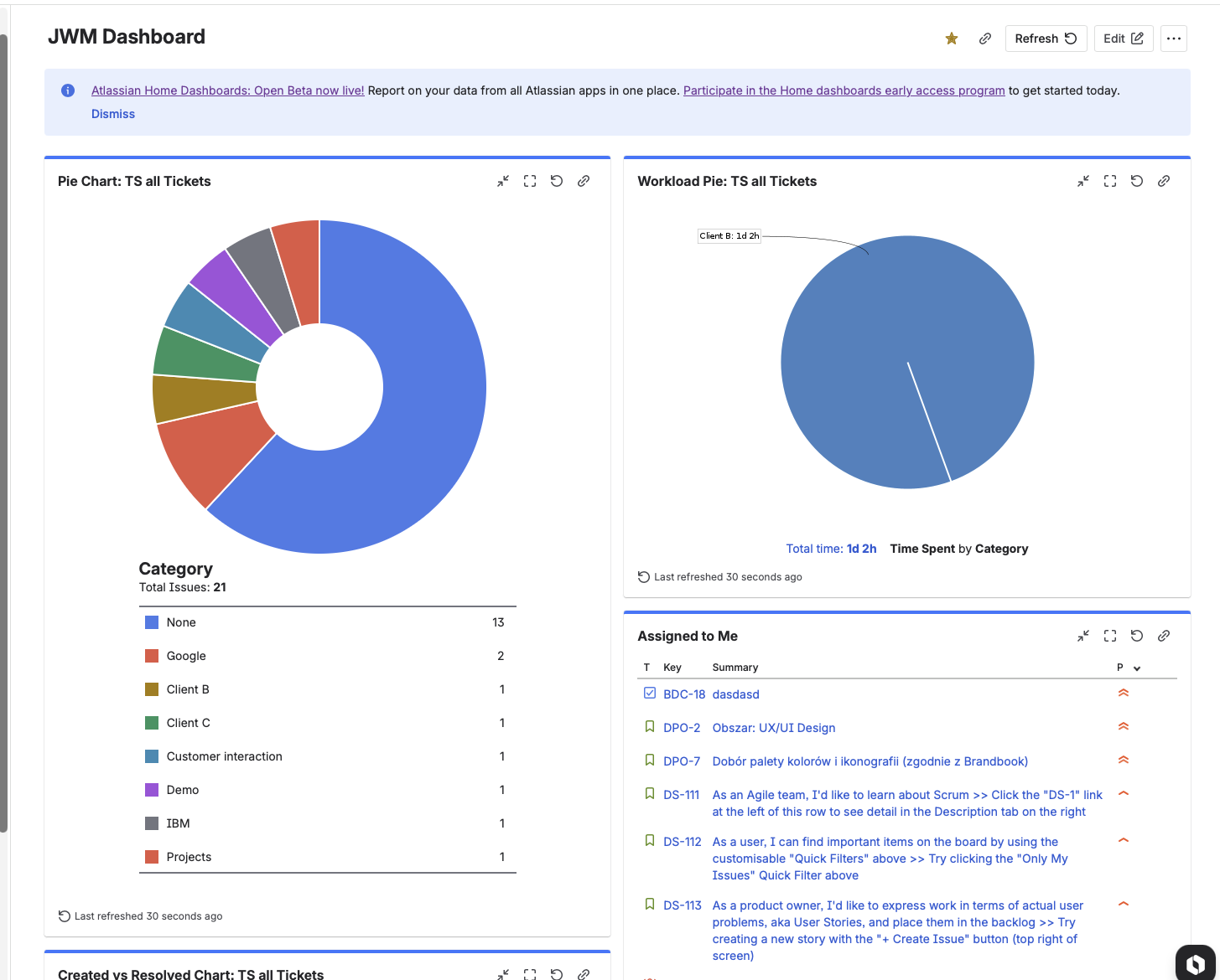
3. Pie Chart
Why it's essential: Visual breakdown of issues by any field (status, assignee, priority, issue type, etc.)
Configuration:
- Select your saved filter
- Choose the "statistic type" (what to group by)
- Set auto-refresh interval
Best Uses:
- Issue distribution by status
- Work distribution by assignee
- Issues by type (bugs vs. stories vs. tasks)
4. Activity Stream
Why it's useful: Shows recent activity across your projects (comments, status changes, new issues).
When to use: Good for staying aware of team activity without checking each project individually.
Tier 2: Situation-Specific Gadgets
5. Sprint Burndown
For Scrum teams: Shows the sprint burndown chart for any active sprint.
Configuration: Select the board and sprint.
6. Sprint Health / Days Remaining
For Scrum teams: Shows how many days remain in the current sprint.
7. Two-Dimensional Filter Statistics
For analysis: Creates a matrix view (e.g., issues by status AND assignee).
8. Created vs. Resolved
For trend analysis: Shows issues created vs. resolved over time. Useful for identifying capacity issues.
Gadgets to Avoid (In Most Cases)
Heat Map — Looks impressive but rarely actionable Bubble Chart — Confusing for most audiences Most "pretty" gadgets — Often add visual noise without insight
The Consultant's Dashboard Strategy
Principle 1: Less Is More
The Problem: First-time dashboard creators add 15+ gadgets because "more data is better."
The Reality: Nobody can process 15 gadgets at once. Dashboards become visual noise.
My Rule: Maximum 6-8 gadgets per dashboard. If you need more, create multiple dashboards.
Layout recommendation:
- Row 1: High-level overview (1-2 gadgets)
- Row 2: Key metrics (2-3 gadgets)
- Row 3: Detailed lists (1-2 gadgets)
Principle 2: Multiple Dashboards for Different Audiences
Critical Insight: Different stakeholders need different information.
Dashboard Set for a Typical Team:
1. "Team Overview" Dashboard
- For: Team members, Scrum Master
- Contains: Sprint burndown, current sprint filter results, blockers
- Update frequency: Real-time
2. "PM Dashboard"
- For: Product Managers
- Contains: Backlog health, upcoming work, cross-project view
- Update frequency: Daily
3. "Stakeholder Dashboard"
- For: Executives, business stakeholders
- Contains: High-level progress, milestone status, KPIs
- Update frequency: Weekly
Many people don't realize you can have multiple dashboards. Use this. Don't try to serve everyone with one dashboard.
Principle 3: Build Dashboards from Filters, Not Raw JQL
Workflow:
- Identify what you need to track
- Create and save filters for each metric
- Star important filters
- Build dashboard using saved filters
- Iterate based on what you actually use
Why this order matters:
When you save filters first, you can:
- Reuse them across multiple dashboards
- Share them with team members
- Update queries once and have all dashboards update
- Access them directly from the Starred Filters gadget
Principle 4: The Quick Gadget Creation Trick
Most people don't know this:
You can create dashboard gadgets directly from the filter view.
Steps:
- Navigate to your filter (Filters > search for your filter)
- Click Export (dropdown menu)
- Select Create dashboard gadget
- Choose gadget type (Filter Results, Pie Chart, etc.)
- Select which dashboard to add it to
- Save
This is the fastest way to populate dashboards from existing filters.
The Shift: Dashboards vs. Project Summaries
What I'm Seeing with Clients
The Pattern:
Several clients have told me they've reduced their dashboard usage because project summaries provide enough information for their daily work.
Typical feedback: "Mike, we used to check dashboards every morning. Now we just look at the project summary. It shows us what we need."
My Analysis:
This makes sense for:
- Small teams (< 15 people)
- Single-project focus
- Teams with simple workflows
- Day-to-day operational work
This doesn't work for:
- Multi-project coordination
- Stakeholder/executive reporting
- Cross-team visibility
- Compliance/audit requirements
When to Use What
Use Project Summaries When:
- You work on one project primarily
- You need quick daily status
- You're an individual contributor
- Information depth is less important than speed
Use Dashboards When:
- You manage or coordinate multiple projects
- You need to share standardized views with stakeholders
- You want persistent, saved reporting configurations
- You need cross-project aggregation
- You have specific JQL-based reporting needs
Use Both When:
- You're a team lead or PM (summaries for daily, dashboards for reporting)
- You work across multiple projects with different reporting needs
- You have both operational and strategic visibility requirements
My Recommendation
Don't abandon dashboards because summaries are "good enough."
Instead:
- Simplify your dashboards — Remove gadgets you don't actually look at
- Reduce to essentials — 4-6 high-value gadgets, not 15 "just in case" gadgets
- Create role-specific dashboards — Different views for different needs
- Enable the Home Dashboards beta — The improvements are significant
The trend isn't "dashboards are dead." The trend is "dashboards need to be more focused and actionable." Home Dashboards beta is Atlassian's answer to this.
Common Dashboard Mistakes (And How to Fix Them)
Mistake 1: Creating Dashboards Before Filters
The Problem: Building gadgets with inline JQL or basic search instead of saved filters.
The Fix: Always create and save filters first. Then build dashboards from those filters.
Why: Maintainability, reusability, and consistency.
Mistake 2: Too Many Gadgets
The Problem: Dashboard looks like a Christmas tree. Nobody can focus on anything.
The Fix: Limit to 6-8 gadgets maximum. Ask yourself: "Do I actually look at this gadget regularly?"
The Test: If you haven't clicked on a gadget in 2 weeks, remove it.
Mistake 3: Poor Naming
The Problem:
- Dashboard named "My Dashboard"
- Filters named "test" or "filter1"
- Nobody knows what anything shows
The Fix: Use clear, descriptive names that include:
- Team or project identifier
- What the dashboard/filter shows
- Audience (if relevant)
Examples:
- "Engineering Team - Sprint Health"
- "[MOBILE] Open Bugs - High Priority"
- "Stakeholder View - Q1 Progress"
Mistake 4: Not Setting Sharing Permissions
The Problem: Dashboard is private, team can't see it. Or dashboard is public, everyone is confused.
The Fix: Configure sharing intentionally:
- Private: Personal dashboards only you need
- Project: Team dashboards for project members
- Group: Cross-team dashboards for specific groups
Remember: Click Add after selecting permissions!
Mistake 5: Forgetting Auto-Refresh
The Problem: Dashboard shows stale data because gadgets don't refresh.
The Fix: Set auto-refresh interval on each gadget (15 minutes is typical for most teams).
Mistake 6: One Dashboard for Everyone
The Problem: Trying to serve executives, team members, and stakeholders with a single dashboard.
The Fix: Create multiple dashboards for different audiences. Different roles need different information.
Marketplace Apps: Are They Worth It?
The Reality About Dashboard Plugins
Popular options:
- Custom Charts for Jira
- Dashboard Hub
- Tempo Custom Dashboards
My honest assessment:
Pros:
- More chart types and visualizations
- Better formatting options
- Some advanced features not available natively
Cons:
- Often expensive (per-user pricing adds up)
- Learning curve for new gadgets
- Dependency on third-party vendor
- May not integrate with Home Dashboards beta
My Recommendation
For most teams: Native dashboards (especially with Home Dashboards beta) are sufficient.
Consider marketplace apps if:
- You have specific visualization needs not met by native options
- Budget isn't a constraint
- You need advanced reporting features (time tracking, capacity planning)
Don't buy marketplace apps just because native dashboards "feel limited." Often, the limitation is dashboard design, not the tools.
Step-by-Step: Building a Team Dashboard
Let's walk through creating a practical team dashboard from scratch.
Step 1: Define Your Audience and Goals
Questions to answer:
- Who will use this dashboard? (Team members? PM? Stakeholders?)
- What decisions should this dashboard support?
- How often will people check it?
Example:
- Audience: Engineering team + Scrum Master
- Goal: Daily sprint health visibility
- Frequency: Daily check-ins
Step 2: Create Your Filters
For this example, create these filters:
Filter 1: "Sprint - Open Issues"
project = "PROJECT-KEY" AND sprint in openSprints() AND resolution = Unresolved ORDER BY priority DESC
Filter 2: "Sprint - Blocked Items"
project = "PROJECT-KEY" AND sprint in openSprints() AND (status = Blocked OR flagged = true)
Filter 3: "Sprint - Completed This Week"
project = "PROJECT-KEY" AND sprint in openSprints() AND resolved >= startOfWeek()
Filter 4: "Bugs - High Priority"
project = "PROJECT-KEY" AND issuetype = Bug AND priority IN (High, Highest) AND resolution = Unresolved
Save each filter with a clear name. Star them for quick access.
Step 3: Create the Dashboard
- Navigate to Dashboards > Create dashboard
- Name: "Engineering Team - Sprint Dashboard"
- Description: "Daily sprint health and blockers"
- Sharing: Add project (your engineering project)
- Save
Step 4: Add Gadgets
Row 1: Sprint Overview
- Sprint Burndown — Select your board and current sprint
- Days Remaining in Sprint — Quick status indicator
Row 2: Key Metrics
- Pie Chart — Filter: Sprint Open Issues, Statistic: Status
- Pie Chart — Filter: Sprint Open Issues, Statistic: Assignee
Row 3: Action Items
- Filter Results — Filter: Sprint - Blocked Items (critical visibility)
- Filter Results — Filter: Bugs - High Priority
Row 4: Quick Access
- Starred Filters — Shows all your starred filters for one-click access
Step 5: Configure Auto-Refresh
For each gadget, set auto-refresh to 15 minutes.
Step 6: Test and Iterate
- Share with one team member for feedback
- Use for a week
- Remove gadgets you don't click on
- Add anything missing
Future-Proofing: Preparing for Home Dashboards
What to Do Now
1. Enable the Beta (If Available)
Go to Atlassian Administration > Settings > Platform experiences > Enable Beta features.
2. Clean Up Existing Dashboards
Before the new system, audit your current dashboards:
- Which dashboards do people actually use?
- Which gadgets get clicked?
- What can be removed or consolidated?
3. Document Your Filter Logic
Make sure your saved filters have:
- Clear, descriptive names
- Documented purpose (in filter description)
- Appropriate sharing permissions
4. Experiment with Smart Links
The new Smart Link widgets let you embed external content. Start thinking about:
- Which Confluence pages should accompany dashboards?
- Would Loom video explanations help stakeholders?
- What context is currently missing from dashboards?
For richer reports with narrative context, see my Confluence Crash Course.
What's Coming (Predictions)
Based on Atlassian's direction, I expect:
Short-term (2026):
- Home Dashboards exits beta
- AI insights become standard
- Better mobile dashboard experience
Medium-term (2026-2027):
- Traditional dashboards sunset or merge with Home Dashboards
- Deeper integration with Jira Goals and Plans
- Advanced cross-product reporting
Long-term:
- AI-generated dashboards based on role
- Predictive analytics (not just historical)
- Real-time collaboration on dashboards
Conclusion: The Future of Dashboards Is Bright
Let me summarize what we've covered:
1. Dashboards are NOT dead
- They're evolving, not disappearing
- Home Dashboards beta shows Atlassian's commitment
- Multi-project visibility still requires dashboards
2. The foundation matters
- Build filters first, dashboards second
- Learn basic JQL patterns
- Use the Starred Filters gadget
3. Less is more
- 6-8 gadgets maximum per dashboard
- Multiple dashboards for different audiences
- Remove what you don't actually use
4. The shift to summaries is real but limited
- Project summaries work for single-project teams
- Dashboards remain essential for coordination and reporting
- Use both for different purposes
5. Home Dashboards beta is worth exploring
- Enable it now on paid plans
- Experiment with new features
- Prepare for the transition
My final advice:
Don't abandon dashboards. Simplify them. Create focused, role-specific views that surface actionable information. Enable the Home Dashboards beta and start learning the new capabilities.
The teams that master dashboards have visibility. The teams that skip dashboards are flying blind.
Don't fly blind.
Need Help with Your Jira Dashboards?
I offer:
Dashboard Strategy Workshop (2 hours)
- Audit your current dashboards
- Design role-specific dashboard strategy
- Build essential filters
- Create 2-3 optimized dashboards
Jira Training (Half-day)
- Comprehensive dashboard and filter training
- Hands-on exercises
- JQL fundamentals
- Best practices and common mistakes
1:1 Consulting
- Custom dashboard design
- Filter library creation
- Team training
- Ongoing optimization
Book a free 15-minute discovery call: calendly.com/projecflow/jira-strategy-call
Additional Resources
Atlassian Documentation:
- Dashboards Guide: https://support.atlassian.com/jira-software-cloud/docs/use-dashboards/
- Home Dashboards Beta: Check Atlassian Community for latest updates
My Resources:
- YouTube: Project Flow Academy (dashboard tutorials)
- Website: ProjectFlow.co.uk
- LinkedIn: linkedin.com/in/mjurdyga
Related Topics:
- Filters and JQL (see my next article)
- Jira Plans for portfolio visibility
- JSM reporting and dashboards